Tuesday, December 20, 2011

Freezing drizzle with an all snow sounding?

Freezing drizzle once again proves to be a difficult-to-forecast, and extremely hazardous form of precipitation.  This point was made all to clearly as 30 cars went off the road on I-70 near Limon, CO resulting in two fatalities during the midday as reported by News9 in Denver.   A prison van containing 9 inmates and two guards was traveling with a trailer when it careened off the road and rolled.

Why was the freezing drizzle so hazardous?  I can easily imagine drivers taking note of drizzle freezing on impact on their windshields and external mirrors.  But they probably didn't take the drizzle seriously.  After all the highway appeared relatively clear according to video from the Huffington Post taken just after the accident. And the freezing drizzle didn't have the dramatic appearance of huge amounts of ice forming that most drivers look for as cues to take action to slow down as if they were going to be driving on a skating rink.  In addition, I suspect road crews didn't respond to freezing drizzle by treating I-70.  In this case, I see no evidence in the video that the highway was pretreated.  If it was then the treatment appeared insufficient to melt the ice given the number of accidents reported.  If they were waiting to time their treatment for the arrival of the snow, they may have completely missed the opportunity to prepare for the freezing drizzle.  The road crews time their treatment according to forecasted timing of winter precipitation.


 The NWS had a winter weather advisory out for the area at the time but there was no indication that freezing drizzle was expected.  From the wording of the advisory issued at 5 am MST, it is apparent to me that the forecasters were expecting snow and not freezing drizzle with an expected arrival time in the early afternoon. When reports came in of freezing drizzle around Yuma, CO around 8:30 to 9 am MST the NWS responded by including freezing drizzle in northeast Colorado.  The NWS eventually included freezing drizzle in their winter weather advisory updates at 1 pm MST for the Limon area.  Had the road crews depended on the forecasts, they may have been caught unprepared for the freezing drizzle.
How was the freezing drizzle detected?  Really the first observations were from  the Automatic Surface Observing System (ASOS) and from spotters.  The ASOS at Limon started to report freezing drizzle around 10 am and Akron a half hour earlier. In this event, the spotters in Yuma, CO  and other places proved invaluable as they beat the ASOS stations in reporting freezing drizzle by almost an hour.  Numerous other places in eastern CO not served by an ASOS would depend entirely on spotters to report freezing drizzle.

The WSR-88D network failed to adequately detect the freezing drizzle.  The areas impacted were too far away to allow the network to effectively detect the freezing drizzle.  In Figure 1 below, the KPUX radar showed no freezing drizzle.  What KPUX did show was an area of snow sublimating as it fell from the higher to the lowest beam.  There was no ability to scan below about perhaps 3000' above the radar level (5298' MSL).  Most of the freezing drizzle likely developed below that level.

Figure 1.  On the top:  a loop of half hourly reflectivity from Pueblo, CO centered over Limon, CO (red dot) from 1517 to 2123 UTC 19 December 2011.  The four panels represent different elevation scans starting with 0.5 deg (upper left) to 1.5 deg (upper right), 2.4 deg (lower right) and 3.4 deg (lower left).  On the bottom:  a meteogram from Limon, CO with temperature, dewpoint in the top pane followed by precipitation type, wind direction/speed (kts), and then ceiling/visibility in the lower panel.


This freezing drizzle was stealthy, falling from shallow clouds easily evading the radar network.  It also fell under conditions that would appear at first to be too cold to allow liquid precipitation to fall.  But once it did fall under such cold weather (see the meteogram from Figure 1), it froze quickly on impact to any surface provided the ground is cold enough as it was in this event.  And as we saw, it was also difficult to forecast leaving little time for the various departments of transportation to pretreat the roads.

But could this event have been forecast?  Difficult is not impossible in my book so let's see what could've helped.  The location of the freezing drizzle was not typical of what would be expected relative to major synoptic features.  Typically freezing rain occurs along a belt poleward of a frontal boundary where some warm air resides overhead to melt the falling snow.  But freezing drizzle can also occur with the entire sounding profile below freezing.  In this case, the freezing drizzle occurred entirely north of the snow shield expanding northward from southeast Colorado (Figure 2). From a standard synoptic climatology, this event was atypical.


Figure 2.  A surface observation plot on 19 December 2011 - 18 UTC with mosaic radar, sealevel pressure isobars, and a frontal analysis.  The freezing drizzle region is outlined in red and the red arrow points toward Limon, CO.

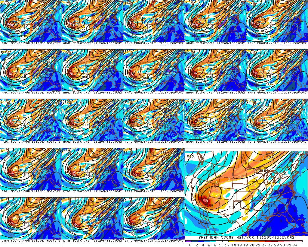
Perhaps the models could've provided some guidance for a forecaster faced with an atypical event.  According to the precipitation type forecast from the Short Range Ensemble Prediction System (SREF), the answer would be no.  None of the ensemble members from the 09 UTC forecast that morning showed any freezing drizzle in eastern Colorado for 18 UTC (1 pm MST).  The only areas with mixed phased precipitation that the SREF forecasted was for the synoptically traditional areas north of the polar front between the rain/snow boundary in western KS (Figure 3).  
Figure 3.  An SREF precipitation type forecast from 19 December 2011 - 09 UTC valid for 18 UTC.  The precipitation type shows as green shading for rain, blue shading for snow, and orange shading for freezing precipitation.  Each small panel represents a different ensemble member while the large panel shows the ensemble mean freezing temperature location.  Graphic provided by Penn-state e-wall website (http://www.meteo.psu.edu/~gadomski/ewall.html).
A forecaster depending on the precipitation type algorithms within the models would not likely anticipate the freezing drizzle event.  Even storm-scale high-resolution models had difficulty in predicting the freezing drizzle.  The High Resolution Rapid Refresh Model (HRRR) didn't provide any help (Figure 4) even when considering multiple consecutive runs.

Figure 4.  Three precipitation type forecasts from the HRRR starting valid for 18 UTC starting with the 14 UTC run (left), 15 UTC run (middle) and 16 UTC run (right).  Blue hatched areas represent snow, green hatching represents rain and red hatching represents freezing precipitation.


Perhaps this was a time to jettison the model precipitation type output and go it alone.  Consider the same SREF forecast output above but now we'll view the sounding profiles through BUFKIT.  And instead of looking at direct model output we use the top down method for determining precipitation type (should precipitation fall).  As it turns out the SREF output contained some clues about the likelihood of freezing drizzle as long as a forecaster understood the precipitation type top-down forecasting method as presented in this course in AWOC Winter (See slide 38).  In a vertical visualization mode for a model site at Limon, a shallow layer of high RH air was forecast by almost every model member in the lowest 3000' above ground for the 09 UTC forecast cycle valid at 17 UTC (10 am MST).  Then almost every run also depicted a dry layer above that indicated a lack of precipitation falling from the elevated moisture in the dendrite production zone (snow production layer in Figure 5). The lower moist layer was a little too warm to efficiently generate snow on its own, and without introduction of ice nuclei by either snow from above or other sources like power plants, liquid precipitation was the most likely result if precipitation were to form.

This scenario seemed to be supported by the echoes depicted by the KPUX radar where occasional spits of precipitation seemed to dry and then reemerge before finally closing in as the freezing drizzle was replaced by snow.  The lowest beam, after all, was sampling the dry layer forecasted by the SREF returns where the precipitation was initially sublimating. After some hours, the precipitation aloft finally managed to saturate the dry layer and the freezing drizzle turned to snow at Limon, but only after the damage was done.
BUFKIT has further guidance to help determine precipitation type.  The panel on the left side of Figure 5 shows an energy diagram indicating the amount of integrated energy above freezing vs the height of the freezing level.  Clearly since the sounding was entirely below freezing, the output of the precipitation schemes depicted snow.  Well, that initially doesn't seem like much help.  But recall, this was one sounding amongst an ensemble for one time period.

Figure 5.  The SREF 8 hour forecast from the 19 December 2011 09 UTC run shown in vertical profiles for Limon, CO.  The skewt on the right shows one of the ensemble member runs indicating the low-level moist layer separated from the high level moisture arriving from the south by a dry layer.  The energy diagram on the left shows a traditional precipitation type of snow if precipitation from the snow production layer was able to survive the descent through the dry layer. 


This run didn't trigger that alert because the coldest temperature of the lowest moist layer was just cold enough to trick BUFKIT to thinking that snow production may have been efficient enough to produce snow.  However, several other ensemble members did trigger an alert in BUFKIT to notify forecasters to consider freezing drizzle (See Figure 6).  Quickly scanning through the SREF members would've that at least a significant minority of members triggered BUFKIT in showing this message.  Even in the absence of this message, just about all members showed the background setup for freezing drizzle.

Figure 6.  Similar to figure 5 except one of the spectral model ensemble members is shown that triggers BUFKIT to warn the user that freezing drizzle is possible (yellow oval).

Even several deterministic runs of the RUC model also showed similar alerts as this model run in Figure 7 showed from the 12 UTC model run valid at 17 UTC.


Figure 7.  Similar to figure 5 except this is a single deterministic RUC model 5 hour forecast from the 12 UTC run.  This model run also triggered BUFKIT to warn the user of possible freezing drizzle.  The moisture profile is similar to the SREF runs.

As we see, the thermal and moisture profiles set the stage to allow freezing drizzle to form.  The problem was that precipitation was not guaranteed.  How could a forecaster be confident that the shallow moist layer would've produced precipitation?  That's the hard part.  The satellite image at 1745 UTC, showed the low-level upslope clouds banked up against the front range and also with implications of that layer extending east along the north side of the Palmer divide (Figure 8).  Northeast winds along the divide clearly provided a good upslope component into the divide.  Provide sufficient moisture for saturation at some starting point away from the divide and the forced upslope would've forced drizzle to form as that air ascended.  It's not a sure bet but given saturation in a shallow cold airstream that's about to ascend for one reason or another, shallow precipitation production seemed to be a possibility.  

Figure 7.  A GOES visible image and surface plot for 19 December 2011 - 18 UTC (1745 UTC for the satellite image) provided by NCAR/RAP (http://weather.rap.ucar.edu/). 


Given the nasty impacts of freezing drizzle, and its capability to cause havoc on unsuspecting travelers, we should pay special attention to the possibilities of its formation.  Forecasting drizzle is still a tough job and I'll be the last person to say that I would've forecasted this event had I been in the hot seat.  So my blog post is really to show that there are clues in the forecast guidance that might help for the next event. And these can give a forecaster the chance to score a major victory by calling attention to the possibility of freezing drizzle. Then its up to the road crews to respond in kind at least to the sensitive areas where they can make a difference even if the lead-time is relatively short.

Addendum - 21 December

I've received a few comments which I should relay.  Al Pietrycha commented that this event is not so rare after-all with respect to the synoptic conceptual models of freezing drizzle events in the Central High Plains.  Often there is freezing drizzle in the upslope ahead of the deep saturated lifting associated with a synoptic system.  I agree with his statement because the low-level upslope often saturates the boundary layer prior to the arrival of the large scale precipitation shield.  In the absence of the upslope, the airmass would likely remain unsaturated, as it often does further east.

A climatology of freezing drizzle was created by Cortinas et al. (2004) from which I include one of their figures below showing the number of days per annum of freezing drizzle.  The Central High Plains reported about one day.  The frequency increased further east to northeast.  However the climatology doesn't address the relative location of the freezing drizzle relative to synoptic systems.  Thus we don't know the relative impacts to transportation of other freezing drizzle events compared to this one.  It's likely many freezing drizzle events may have occurred after road treatments were applied.


With respect to other observational platforms that could detect freezing drizzle, Al mentioned two platforms: mesonet stations and webcams.  The former doesn't have a precipitation type detector directly but the anemometers often stop spinning upon the accumulation of ice and thus the onset of suddenly calm winds across more than one station would be a good indicator of freezing drizzle and rain.  Al mentioned that webcams are useful because the lenses often ice up during freezing precipitation events.


Reference
Cortinas Jr., J. V., B. C. Bernstein, C. C. Robbins, J. Walter Strapp, 2004: An Analysis of Freezing Rain, Freezing Drizzle, and Ice Pellets across the United States and Canada: 1976–90. Wea. Forecasting, 19, 377–390.        

Wednesday, December 7, 2011

The phantom snow forecast for 05 December 2011

Oh how we wish for snow that as soon as a model shows a forecast snow storm, we get excited and throw reason out the window.  A case in point was demonstrated so well on 02 December 2011 in Norman, OK.   What was a supposed to be a shearing positively tilted upper-level trough leaving us with no consideration of a second, wintery act, became suddenly a deeper carved out trough with a downstream ridge (figure 1).  That downstream ridge upstream trough would've resurrected the low-level jet back to our southwest giving us a big snow storm as that moisture-laden jet surged over a dome of arctic low-level air draped over us.  The result was a global ensemble mean six hour probability of .25" of precipitation forecast ending 18 z 05 December going from nothing to 60% (figure 2).  Deep cold air meant we'd get the majority of that as sleet or snow.  And since this was an ensemble mean, that meant quite a few ensemble members were going for 1" storm total liquid equivalent with a few members of the short-range ensemble dropping a full 2" of liquid equivalent precipitation on us, most of it frozen (figures 3-4).


Figure 1.  Global Ensemble Forecasting System (GEFS) forecast valid for 05 December 2011 - 18 UTC.  The left (right) two panels was from the 18 UTC forecast on 01 (02) December.  The top two panels represent spaghetti plots of selected 500 mb heights.  The bottom two panels represent the ensemble mean 500 mb heights with standardized anomalies shaded.
Figure 2.  The same as figure 1 except the top two panels represent the probability of 0.25" or greater liquid QPF ending at 18 UTC of the forecasted time.  The bottom two panels represent the spaghetti plots of the six hour 0.25"QPF.

Figure 3.  SREF ensemble meteogram forecast made 02 December   2011 - 03 UTC for Norman, OK visualized in BUFKIT.  The green (blue) traces represent accumulation of liquid QPF in inches in liquid (frozen) form (see white labels on the right).  The white traces represent the snow accumulation in inches using the same white labels on the right.  The red traces represent 2m temperature in F.

Figure 4.  Same as figure 3 except for the forecast made 02 December 2011 - 15 UTC.


Needless to say, the impact of this bullish turn of model projections instigated a rush to the Hazardous Weather Testbed by all sorts of National Weather Center members (figure 5).  That included me of course.  We all wanted to see the monster snowstorm play out on the various model runs displayed on the big 60" monitors.  
Figure 5.  A scene from the Hazardous Weather Testbed from 02 December 2011.

Was there reason amongst any of us or did we throw logic out the window and replace it with weather weenie ghoulish masochism?  Well, a few of us wondered how we'd get that new short-wave trough from Alaska to Northwest Territories and all the way down into Arizona in perfect synchrony to recharge the long wave trough in just the right position.  Some others were more interested in whether we'd get 3" of sleet or 18" of snow.  Luckily the important folks next door at the NWS office weren't too swayed by these juicy predictions.  They did respond with a special weather statement highlighting the potential for accumulating snow after Sunday.


MEANWHILE...ANOTHER STORM SYSTEM OVER THE SOUTHWESTERN 
STATES WILL BEGIN TO MOVE EAST BY SUNDAY NIGHT.  PRECIPITATION...
MAINLY IN THE FORM OF SNOW...MAY BEGIN TO FALL ACROSS PARTS OF
WESTERN OKLAHOMA AND WESTERN NORTH TEXAS AS EARLY AS SUNDAY
NIGHT.  ON MONDAY...SNOW MAY SPREAD EAST INTO CENTRAL AND SOUTHERN
PARTS OF OKLAHOMA.  AT THIS TIME...THE BEST OPPORTUNITY FOR
ACCUMULATING SNOWFALL APPEARS TO BE SOUTH OF A LINE FROM TULSA
TO OKLAHOMA CITY TO LAWTON AND VERNON...TEXAS.  IT IS TOO EARLY TO 
PREDICT EXACT AMOUNTS OF SNOW AND THERE IS STILL THE POSSIBILITY
THAT LITTLE OR NO SNOW WILL FALL.


The bullish snow forecasts continued for another two SREF ensemble runs and then the disappointment began.  Starting with the 03 December 03 UTC run, most of the members of the ensemble started to back away from the prodigious snow totals.  By the late morning on the 3rd, the runs showed almost nothing.  The NWS office, acting with momentum, kept the wording in for potential snow, forecasting 3-6" in snow bands from their 5 am outlook, and then started to back off by 11 am with wording as below:


AT THIS TIME...THE BEST OPPORTUNITY FOR ACCUMULATING SNOWFALL 
APPEARS TO EXTEND FROM NEAR HOLLIS... VERNON AND WICHITA FALLS AREAS 
NORTHEAST TOWARD HOBART... LAWTON... DUNCAN...OKLAHOMA CITY...AND 
STILLWATER. WIDESPREAD LIGHT ACCUMULATIONS LESS THAN TWO INCHES ARE 
EXPECTED...AND THESE ACCUMULATIONS WOULD BE MAINLY CONFINED TO 
GRASSY SURFACES...CARS... AND TREES.


Well, the model runs kept going drier and drier to the point where nothing was forecast by 36 hours in advance of the supposed event.  To see an animation of SREF dmodel/dt,  check out the 500 mb (figure 6), surface 6 hour precipitation plots (figure 7) from the Penn State e-wall site.  There's a few missing runs and panels but the point should be made pretty clear about the phantom snow runs starting early morning on the 2nd and then ending 24 hours later.

Figure 6.  A loop of SREF individual ensemble members (small panels) and the mean (large panel) 500 mb height and absolute vorticity (shaded) valid for 05 December 2011 - 15 UTC.  The loop began at initialization time of 01 December   2011 - 21 UTC and ended 03 December 2011 - 21 UTC.  Some six hourly initialization times were missing.

Figure 7.  Similar to figure 6 except for sea-level pressure, 1000-500 mb thickness and  3 hour precipitation in mm.

Perhaps this animation below better shows the onset and demise of our wishes for a big snow storm using dmodel/dt of our time trace SREF forecast snow accumulation courtesy of BUFKIT (figure 8).  The white traces represent total snow accumulations by each run where time increases to the left.  The animation starts out with only a couple members forecast a few inches by 15 UTC on 05 December (Monday), then a sudden surge in model aggressiveness with a few members going well above 8" and then the disappointing demise of the potential at the end of the loop (that's 15 UTC 03 December).

Figure 8.  Similar to figure 3 except that this is a loop of meteograms starting from 01 December   2011 - 21 UTC and ending 03 December 2011 - 21 UTC.

My takeaway from this event was that inter run differences can still exceed the range of possibilities within each ensemble run.  I may be too harsh because technically there was an ensemble member during the most bullish SREF that had little snow but no runs during the Friday late morning runs were forecasting a totally dry Monday.  Two runs later Friday night and we see a bunch of dry runs.

So, like the NWS, it's preferable to play the role of being a 'big ship' and contain our collective excitement.  Luckily no watches or warnings were issued because the forecasters were not sold yet on an event that would overwhelm the relatively warm ground with loads of snow and ice.   Still, it is okay to dream a little with some help from an overly aggressive model run.  After all, sometimes we get an event that exceeds its expectations.

Sunday, December 4, 2011

Extreme winds in California

One of the biggest southwestern US wind episodes in the last 10 years occurred on 01 to 02 December 2011 as an intense northerly pressure gradient formed between a near record strong surface high pressure system in the Pacific Northwest states and a relatively strong surface low formed in Arizona.  This wasn't any ordinary event.  Winds gusted to 92 mph in Pasadena - CA, 98 mph in Kane Springs - NV, 102 mph in Centerville - UT, 123 mph in Steamboat Springs - CO, and 150 mph at the top of Mammoth Mountain - CA!  There were winds to near hurricane force from central CA all the way east to western CO and south to near Albuquerque, NM.  Three selected maps show some of the other gusts around central CA (Figure 1), the Wasatch Valley (Figure 2), and the LA Basin (Figure 3).

Figure 1.  Peak wind gusts in mph for central CA on 01 December 2011.  (courtesy of  MesoWest)

Figure 2.  Peak wind gusts in mph for the Wasatch Valley, UT on 01 December 2011.  (courtesy of  MesoWest)

Figure 3.  Peak wind gusts in mph for the LA basin on 01 December 2011.  (courtesy of  MesoWest)
 Mammoth Mountain ski area on the eastern side of the central Sierra mountains certainly took top prize for the strongest wind gusts.  An anemometer recorded multiple peak gusts of 150 mph at the top of the gondola ride around 11 kft AGL(Figure 4)!  That so many wind gusts hit 150 mph means the anemometer may have proverbially 'hit the wall' and that the true wind may have been higher.  The worst of the winds occurred 00 - 06 PST (08 - 14 UTC) on 01 December.  

Figure 4.  Wind meteogram of Gondola 2 summit anemometer on the top of Mammoth Mountain, CA.  (Courtesy of MesoWest)
These insane winds were primarily ridge top events that many other peaks all across the Sierras, Wasatch and numerous other mountains, likely shared.  But note that winds were much weaker just off the peaks.  As Figure 5 shows, other anemometers away from the ridges and peaks registered much lower winds.  An anemometer at the base of Mammoth only registered 5 mph!  What a difference a few feet makes!

Figure 5.  A micronet plot of stations on Mammoth Mountain, CA at 01 December 2011 - 05 UTC.

Needless to say this intense wind event resulted in numerous reports of damage.  There are too many to list here but the highlights include 400 buildings damaged in Pasadena with 40 of those evacuated, a roof blown off a condo in Steamboat Springs - CO, and multiple trucks blown off I-15 north of Salt Lake City.  The Capital Weather Gang provided a wealth of information, pictures and video regarding the impacts of this event in one of their posts.

What caused this event to be so intense?  There was a big upper-level trough diving southward with very strong winds on its west side (Figure 6).  This amplification set the stage to intensify the low-level low over western Arizona while at the same time a strong low-level high built into the Pacific Northwest.  The increase in the pressure gradient between these two features helped to rapidly enhance the northeasterly winds.  This setup is common in the Southwest US leading to the infamous Santa Ana Winds.  During a typical cool season, the LA Basin can expect 20 of these events based on a study by Raphael (2003).  This one, however, was exceptionally strong.  But how strong was it in compared to the climatology?

Figure 6.  500 mb heights and observations for 01 December 2011 00 UTC ( top left) and 12 UTC (top right).  850 mb heights and observations for the same date 00 UTC (bottom left) and 12 UTC (bottom right).  Courtesy of SPC.

One way to compare to a climatology is to look at how the sea-level pressure pattern of this event matches that of other Santa Ana events.  In figure 7, the sea level pressure analysis from the Short Range Ensemble Forecast System showed a 1000 mb low in Arizona and a 1040 mb ridge from Washington state to Montana.  A composite of Santa Ana events compiled by Jones et al. (2010) only yields a 1028 mb sea-level high in Wyoming and a 1016 mb low just south of Arizona.  Clearly this event exhibited a much stronger pressure gradient than the composite.  However you could argue composites appear weak just by the way they average out the placement of individual low and high centers.  

Another way to compare with climatology is through standardized anomalies in a similar manner to Hart and Grumm (2001).  Without going into a long description of using standardized anomalies, they infer how many standard deviations from the mean a particular parameter happens to be.  For sea-level pressure, standardized anomalies reached -3 standard deviations for the sea-level low at 09 UTC on 01 December while the corresponding high reached 2 standard deviations for the same time (Figure 7).  These values persisted for several hours during the morning before the low filled slightly during the late afternoon.  It certainly represented a stronger than normal Santa Ana sea-level pressure pattern but there have been stronger sea level pressure standardized anomalies from non Santa Ana events.    

The mean height standardized anomalies for multiple pressure levels up to 250 mb at 09 UTC (Mheight) also do not show any standout values (< +- 4), especially considering that the top 10 events of Mheight all had values greater than 5 (see Graham and Grumm 2010).  

However the standardized anomalies for wind painted a much stronger event.  Low-level standardized anomalies were analyzed by the SREF to exceed +- 5 standard deviations for both the U and V components, especially over southern CA and along the Wasatch mountains (Figure 7).  The 15 UTC analysis showed values exceeding 6 standard deviations in northern UT!  Considering that the analysis in Figure 7 represents the mean of 21 members, these numbers are quite impressive.  The anomalies drop off with height so that at 250 mb, we only see 3-4 standard deviations along the back side of the trough.  Now I don't have all the standardized anomalies for wind for each pressure level but I say that there is a possibility for these wind anomalies to reach the top 20 and maybe the top 10 events in the western US for wind as determined by Mwind found by Graham and Grumm (2010).  Mwind is the mean of the maximum absolute standardized anomalies found for each pressure level across the western US.  The Mwind ranges from 4.5 to 4.9 for the top 10 events using Mwind.  So now we're seeing the possibility that this wind event is not only the worst Santa Ana event in 10 years for southern CA but may rank among the 10 biggest events for the western US.  Remember this event was widespread across a huge chunk of real-estate.


Figure 7.  The output from the  01 December 2011 - 09 UTC short range ensemble forecasting system output including sea level pressure contours with standardized anomalies (shaded, upper left), and 850 mb winds with V (U) wind standardized anomalies in the lower left (lower right) panels.  The upper right panel shows a composite sea level pressure pattern for Santa Ana wind events for 20 years ending in 2008 from Jones et al. (2010).

The standardized anomalies can be used to also show how rare some of these events happen to be.  If measured by sea-level pressure, the return period for the maximum value found (negative 3-4 standard deviations) would only be once every few months (Figure 8).    However, we don't have a calculation of return intervals of the difference between the maximum and minimum standardized anomaly in the Western US.  Had we such information, we may find a much longer return interval.  This chart can be found in the Western Region standardized anomaly webpage.
Figure 8.  Sea level pressure standardized anomaly return periods for the western half of the U.S. based on the North American Regional Reanalysis data (from Graham and Grumm, 2010). The red vertical lines represent the maximum and minimum standardized anomalies for 01 December 2011 in the same area.

The standardized anomaly return periods for winds at 850 mb does show a much longer return period for both the U and V components.  In fact, judging by the noisy trends at the +- 5 standard deviations range, there have not been too many events to construct a reliable return interval.  What we do see is a value in excess of 100 months or close to 10 years.  Wait, the media's claiming the Santa Ana event was also the worst in 10 years!  Is this coincidence by design?  Well, not likely and more likely this is coincidence.

Figure 9.  Similar to figure 8 except for  850 mb V-wind (U wind) standardized anomalies in the top (bottom) panels respectively.

The synoptics showed the case for a widespread wind event.  The details are very much governed by local topography.  Given the variety of the topography in the west, we could expect to see a wide variety of behavior in the localized enhanced wind.

As an example,  there is the ridge top wind to consider and the SierraNevada mountains are well known for this phenomenon.  To highlight the Mammoth Mountain extreme winds, let's take a look at the    10 hour forecast sounding profile from the NAM (Figure 10) taken from near Bridgeport lake, CA.  This sounding site is located about 30 mi north of Mammoth Mountain ski area.  The winds were unusual in the combination of the strength and direction.  Almost the full component of the wind was normal to the orientation of the Sierras and a rule of thumb that the NWS office in Reno used in their ridge-top wind forecasts was to double the ridge-level  winds.  A doubling of the winds resulted in a forecasted 110 mph sustained winds at the top of Mammoth Mountain by 10 UTC.  That's a little short of the observations as winds were hitting a sustained 140 mph well before this time.

The time-height forecast for this site showed that the winds at 1 km (AGL) were strengthening all the way to 15 UTC (Figure 11).  However the strongest observed winds plateaued starting at 07 UTC. It's possible that the ridge top stable layer helped promote an acceleration of the winds helping to accelerate them more than the rule of thumb.   Assuming the relationship continued as the forecasted winds increased to 80 kts, then I can understand concerns by forecasters of wind gusts reaching 200 mph at mountain top by 15 UTC.  Hindsight revealed that the strongest winds occurred around 07-09 UTC.  We'll never know how strong they were because the anemometer's maximum possible reading appeared to be 150 mph.
 
Figure 10.  A WDTB WRF ensemble 10 hour forecast sounding from the NAM NMM 212 KF member valid 01 December  2011 - 10 UTC for a site KBDG near Mammoth Mountain, CA.  The hodograph range rings are in 10 m/s intervals and the white diagonal represents the axis of the SierraNevada mountains.  The wind profile is marked by the yellow line segments from the surface to 6 km AGL.  On the SKEWT, the shaded brown region in the lowest km represents the height of Mammoth Mountain with respect to the altitude of KBDG.  More information on the rest of the display can be found in the WDTB BUFKIT webpage.
Figure 11. A time-height plot of the same forecast model, location, and time as in Figure 10.  The contours show forecast horizontal wind in kts.  The brown shaded region indicates the height of Mammoth Mountain from KBDG.  
Whereas the Sierra ridge top case showed an example of Bernoulli acceleration with possible enhancement by an appropriately positioned stable layer, the Santa Ana local wind appeared to be induced by a mountain wave.  From the same model run, we took a 7 hour forecast from the 01 December - 00 UTC run for Ontario, CA (Figure 12).  Here, there's more evidence that a critical layer may have helped to trap lee waves.  While the component of the winds perpendicular to the San Bernardino mountains never was forecast to reach zero, there was a forecasted reversal in shear close to ridge top level.  There was also a stable layer forecasted to be located near the ridge top too.  Now the morning soundings didn't show the stable layer as pronounced as forecast at ridge top but the reversal of shear was observed at San Diego.  Perhaps somewhere a critical layer did form exacerbating a downslope wind event.  Perhaps that location happened to be Pasadena where widespread damage was observed.  Too bad there weren't any observed soundings in the area the morning of 01 December.

Figure 12.  Similar to Figure 10 except for Ontario, CA valid at 07 UTC .


References:

Graham, R.A., R. H. Grumm, 2010: Utilizing Normalized Anomalies to Assess Synoptic-Scale Weather Events in the Western United States. Wea. Forecasting, 25, 428–445.

Hart, R., and R. H. Grumm, 2001: Using normalized climatological anomalies to rank synoptic-scale events objectively. Mon. Wea. Rev., 129, 24262442.

Jones, C., F. Fujioka, L. M. V. Carvalho, 2010: Forecast Skill of Synoptic Conditions Associated with Santa Ana Winds in Southern California. Mon. Wea. Rev., 138, 4528–4541.

Raphael, M. N., 2003: The Santa Ana Winds of California. Earth Interact., 7, 1–13.