Monday, February 25, 2013

Incredible snow forecast for Woodward, OK — or is it?

We're in of what could be the biggest snowfall in Oklahoma history if you believe some of the models.  On 00 UTC Feb 25, the NAM put out a nearly outrageous forecast of 30" or more for Woodward, OK.  No wonder that was the case because the storm system coming across New Mexico is expected to close off and then pivot around an axis in Northwest Oklahoma allowing the precipitation band to remain firmly entrenched for hours.


Even earlier, the 21 UTC SREF (Short Range Ensemble Forecasts) snowfall chart shows a mean dump of over 25" in Woodward.  In the image below, all of the ensemble members are plotted on the same timeline from the SPC website (time increases to the right).  Some of the forecasts bury Woodward in over three feet of snow! To make a comparison, the big nor'easter in New England dumped a record 36-40" of snow in Connecticut.  If the upper end of these forecasts came true, this storm would be even more unusual.
But wait, there's one subtle feature here that can make or break this monster snow forecast and that is the forecast snow ratio and compaction.    First, snow ratio is incredibly complex to measure, or to even have consensus as to how to measure.  Before the snow even hits the ground, there are a multitude of factors within and below the cloud that can affect the density of snow flakes.  Crystal shapes can change quickly from relatively compact plates to the more classic dendrites just by changing the supersaturation of the cloud ever so slightly.  Some research indicates that supersaturation increases when the vertical velocity increases.  But supersaturation can also depend on how fast the liquid and gaseous water is being scavenged out by the crystals themselves.  That's a feedback loop that can gunk up our initial guess.  Then when a crystal falls into warmer saturated air, it can accrete other crystals, grow new ones right from water vapor, or directly intercept liquid cloud droplets.  The rate at which these processes happen again depend on the vertical velocity, liquid and vapor content in the cloud and the number of ice crystals competing in the same space for available water.  The end result of all these processes is a flake of snow with a certain density.  This is a process that cannot be directly observed by operational forecasters.

However, we attempt to make some assumptions about the density of the falling snow flakes as a function various simpler processes and then see what happens to the forecast snow to liquid ratio (a simplistic estimate of falling snow density).  The most simple estimate is to just apply a climatological average snow ratio.  One is available here created by Dr. Martin Baxter.  Let's assume a 12:1 ratio and we get a timeline of snow accumulation (called a plume diagram) for an ensemble member near the mean snow fall. The time now increases right to left and the appropriate axis is labeled in inches in the far right.  The blue line below shows the 12:1 ratio and the accumulation peaks just over 20", a respectable snow storm.  


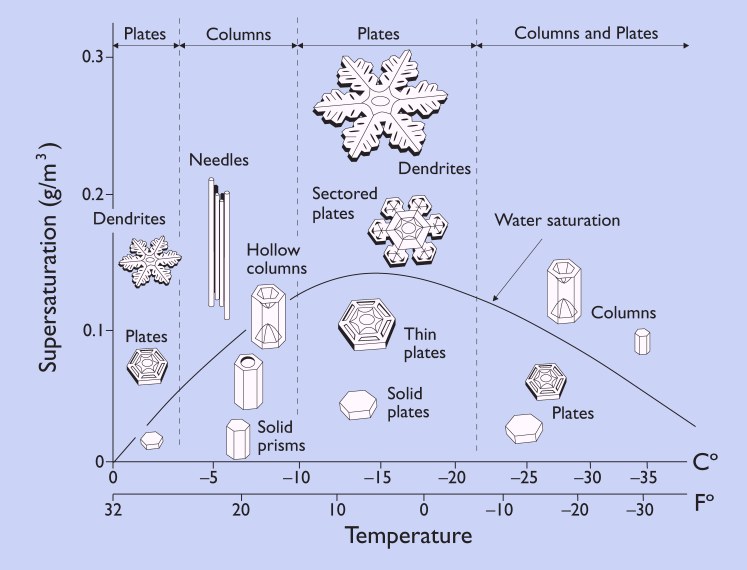
But there are other techniques.  A maximum temp in profile technique assumes the snow ratio increases as the maximum temperature in a vertical column decreases.  The thinking here is that the density of falling snow decreases as the maximum temperature in the warm layer aloft decreases.  There may be some merit to that if that warm layer is saturated since the maximum liquid cloud water content available for riming decreases as temperature decreases.  Notice here the forecasted snow ratio for max temp in profile slowly increases as the air cools aloft.


Meanwhile there is the Zone omega technique (colloquially called the Cobb 05 technique) where snow density decreases if the strongest ascent occurs in the dendrite production zone (-12 to -18 C).  I talked about this a couple years ago before our drought when we had a much colder snow storm.  This is a horribly difficult method to verify and this method is completely statistical.  The Woodward forecast below also shows the extreme volatility of the snow ratio.  The snow fall winds up being pretty high (25-30") because this technique allows for snow ratios exceeding 40:1 if the vertical motion spikes in the dendrite production zone.  Many times this technique overestimates the ratios (underestimates falling snow density) based on the experience of forecasters.


Due to the errors, an alternate version of the technique cuts the snow ratios for each temperature down by almost a factor of two.  Now the snow fall is around 23", or similar to that of the first two techniques. 

 
What we discussed so far only represents our best attempt at predicting the density of falling snow.  What happens after the snow hits the ground before we go to measure it is a completely different matter.  Snow begins to compact immediately after the flakes hit the ground and accumulate.  Every one of the graphics above initiates a compaction routine based on an time-dependent exponential decay function.  That's why the forecast snow accumulations decrease with time.  If we removed that function, the purple line shows the snow depth forecast and now you can see values in excess of 35". 


However, the exponential decay function is static, and therefore presents an unrealistic display of the processes that affect snow compaction.  Perhaps the only realistic component of this is that the compaction continues with time and thus presents an idea of how much snow depth loss (density increase) occurs before someone measures the snow.  But the rate of compaction can change according to the wind. The stronger the wind, the more blowing and drifting of snow causes crystal breakup and compaction.  A strong wind like what Woodward is expecting today could cause drifts compact enough to support someone walking on them.  If so, that kind of density is going to be associated with very small snow ratios, maybe 3 to 4:1!  But let's assume a flat, representative surface for measuring snow.  If that's the case then there's a nifty neural net (called the Roebber technique) located here that allows you to enter in the QPF (in liquid equivalent) and the expected wind speed.  It will estimate the snow ratio for you.  I entered in 2" of QPF and a 25 kt wind, certainly reasonable numbers for today.  The output snow ratio falls to 9:1.  That would yield less than 20".  The Roebber technique also accounts for temperature related compaction.  Certainly some of that occurred since Woodward was well above freezing yesterday.
 
 
All of this of course depends on an accurate QPF.  Fortunately Woodward is in an area where the SREF had a high probability of > 2" of QPF and therefore a high confidence of forecasting if this snow will be recordbreaking or not.  For those less fortunate areas where the QPF uncertainty is greater, the errors in snow ratio may not matter so much.  


Monday, February 11, 2013

A sun pillar caught me off guard

Our drought seemed to have caught me unprepared for this evening where the clouds actually consisted of liquid water and a sun pillar formed.  A field of altocumulus clouds spread overhead from the west marking creating another spectacular sunset, one that I hopefully adequately captured from the bottom of Lake Thunderbird's Jim Blue bay.

An altocumulus-filled sunset from Lake Thunderbird 2013-02-11 2354 UTC.
This cloud layer occasionally sported small trails of snow precipitating out from each individual altocumulus.  The altocumulus clouds were cold, but how cold?  To answer this question, I referred to a vertical sounding taken at the National Weather Center.  The balloon usually launches around 23 to 23:15 UTC, or up to 50 minutes before this shot was taken.  The altocumulus clouds were overhead at launch time and so I'm pretty confident that the thin layer of moisture at 600 mb in the sounding below represented the altocumulus layer.  If so then they were centered around -10 to -15 deg C, right about the temperature where snow crystals like to form fairly quickly.

The vertical sounding taken at Norman where the balloon likely passed through the altocumulus layer at about 2330 UTC.
A little later, a spectacular sun pillar formed to our west as the sun fell just below the horizon.  Unfortunately I was caught off guard eating dinner after shooting the early pictures, and so my only picture was taken through a nest of Post oak branches.  Other folks in town were more fortunate and grabbed some really nice unobstructed shots.

A sun pillar caught through the branches of our trees at home taken 2013-02-12 0018 UTC.

I should've been more prepared to shoot this sun pillar at a better location because they are rare in this part of the country, more rare than sun dogs and possibly rainbows.  Sun pillars like to form from sunlight reflecting off the top and bottom faces of plate crystals that are tilted upward toward the sun, especially a few minutes after the sun has set.  This site explains the process very nicely.  Given that supercooled altocumulus clouds were present, the pillar seemed to show a presence of a pretty widespread field of ice crystals which were probably dominated by plates.   The roughly -10 to -15 C temperature of this layer can easily produce plates as long as the supersaturation is low.  Take a look at the morphology diagram like this one from snowcrystals.com.


I doubt the supersaturation was high otherwise we'd be looking at stronger updrafts and more beefy looking altocumulus castellanous, or a continuous sheet of nimbostratus if there was widespread lift.  Then forget about seeing the sunlight.  No, these little altocumulus were barely able to condense liquid water.  They also formed quickly, as expected, before the pictures above were taken and then moved northeast overhead (see the satellite image below).  Why was that expected?  Because the rapid ice crystal formation would quickly scavenge the clouds of their water supply eventually converting all the altocumulus to ice trails (virga).  

The satellite image also shows that this field appears to have been connected to the larger shield of warm advection clouds forming above a polar airmass from a departing surface high to the east.  The 850 mb and 700 mb plots below show the gulf moisture sliding over the lower level cold air and perhaps our altocumulus cloud deck formed from this same warm air advection but in a very thin layer.

While the warm air advection happens relatively frequently (except when we're in drought) it is rare to get such a thin layer of lift to condense a small amount of moisture into altocumulus clouds at temperatures that support plates (for the best pillars) and yet have not had time for the liquid water to completely be scavenged out by the forming ice crystals.  How many times a year do I see these conditions get met at sunrise or sunset without intervening cloud layers to dim the sun?  Not too often.  Next time I'll be prepared for a sun pillar shot but I suspect I'll see a lot of tornadoes before then.
Visible satellite loop from 2013-02-12 2002 to 2315 UTC.


Surface analysis from NCEP/HPC for 2013-02-12 00 UTC.


Thursday, February 7, 2013

One day snow forecast for NYC 2 - 20" ??

The epic nor'easter is only one day away from New York City with precipitation already spreading up to Virginia and the pressures are falling fast just offshore and yet the model guidance cannot give us any clue whether or not they'll get 2 or 20" of snow.  Twenty one members of model guidance shows an absolutely huge spread in possible snowfall amounts for JFK airport.  In the timeline plot below, the grayish curves show the snow fall rapidly increasing and then reaching a peak before the snow pack settles down as the time increases to the left.  But some of the model solutions show almost no snow at all.

A time trace of 21 model members of the Short Range Ensemble Forecast (SREF) system for JFK airport from the run starting at 2013 Feb 07 21 UTC.  Time runs from right to left.  The grey traces represent snow whose amounts can be determined from the right vertical axis.  The green to blue traces represent the liquid equivalent amount forecasts.  The horizontal blue line represents a static snow to liquid ratio of 12:1.
What in the world is giving this amazingly huge uncertainty for being only one day out?  One reason could be the wide spread in precipitation forecasted by the forecast ensembles.  The blue traces above also show a huge spread ranging 0.6" to nearly 4.0" of liquid equivalent.  The total precipitation map below shows how some model solutions almost leave New York City high and dry.

The total liquid equivalent precipitation forecast from each SREF member in the small squares and the mean in the large square.  The model run was at the same time as the figure above and valid for 2013-Feb-08 21 UTC.  Note some of the members forecast the heavy precipitation to fall south of NYC.  Image courtesy of the Penn State e-wall.

However that's not the full story.  Not only is the amount of precipitation unusually uncertain for NYC but the model members are unsure what side of the freezing line the temperatures should be.  Here is another multi-panel image from the Penn State e-wall site showing the expected precipitation type and the location of the surface and 850 mb freezing line for the afternoon on Feb 08 (21 UTC).

Same SREF model run time and forecast hour as above but now I show the expected precipitation type (blue for snow). The blue contours show the surface freezing line while the black contour shows the freezing line at 850 mb.  Notice the uncertainty of the freezing line around NYC.

Visualized another way is this SREF sounding plot below showing all the members plotted.  All the members show that surface temperatures should be cold and likely from 30 to 40 F.  That's unfortunately centered around freezing and the results are dramatic with respect to what kind of precipitation is expected to fall.  The left panel shows a huge splatter of expected precipitation types in the late afternoon based on a partial thickness technique.  Unfortunately changing the technique won't improve the uncertainty what will fall in the late afternoon for NYC.

Forecast SREF profile of temperature (red) and dew point (green) for JFK valid for 2013 Feb 08 21 UTC.  The left panel shows the expected precipitation type for each model run (red circles) based on the partial thickness technique.  

This forecast dilemma is not going to improve until we actually see the observations in the morning and see which side of the freezing line New York City will happen to reside.  I'm going to be paying special attention to the AMDAR aircraft sounding profiles as they take off from the NYC area airports.  Unfortunately I hear that flights are being canceled left and right in the NYC area just when we need frequent observations of temperature aloft.  That's why frequent radiosonde launches will be so critical for the NYC area tomorrow.  It's the only platform that can successfully get us the data we need in bad weather.  That is unless some group can fly foul weather drones.

Now for the Boston area, there is more confidence of higher liquid equivalent precipitation though a couple model members leave Boston almost as dry as New York City.   As for snowfall, there is also a similar uncertainty in temperatures but all the runs "safely" keep Boston below freezing throughout the atmosphere and snow, and lots of it, is a virtual certainty.

Same kind of time trace for the SREF as above but for Boston, MA.  Note the precipitation uncertainty is similar as fo

Same forecast model sounding for the SREF as above but for Boston, MA.  The low-level temperature uncertainty appears just as high for BOS as for JFK but the soundingis colder and all members forecast snow.